Cristalino Lodge (Rebrand)
Brand Strategy | Identity Systems
Where luxury meets the Amazons
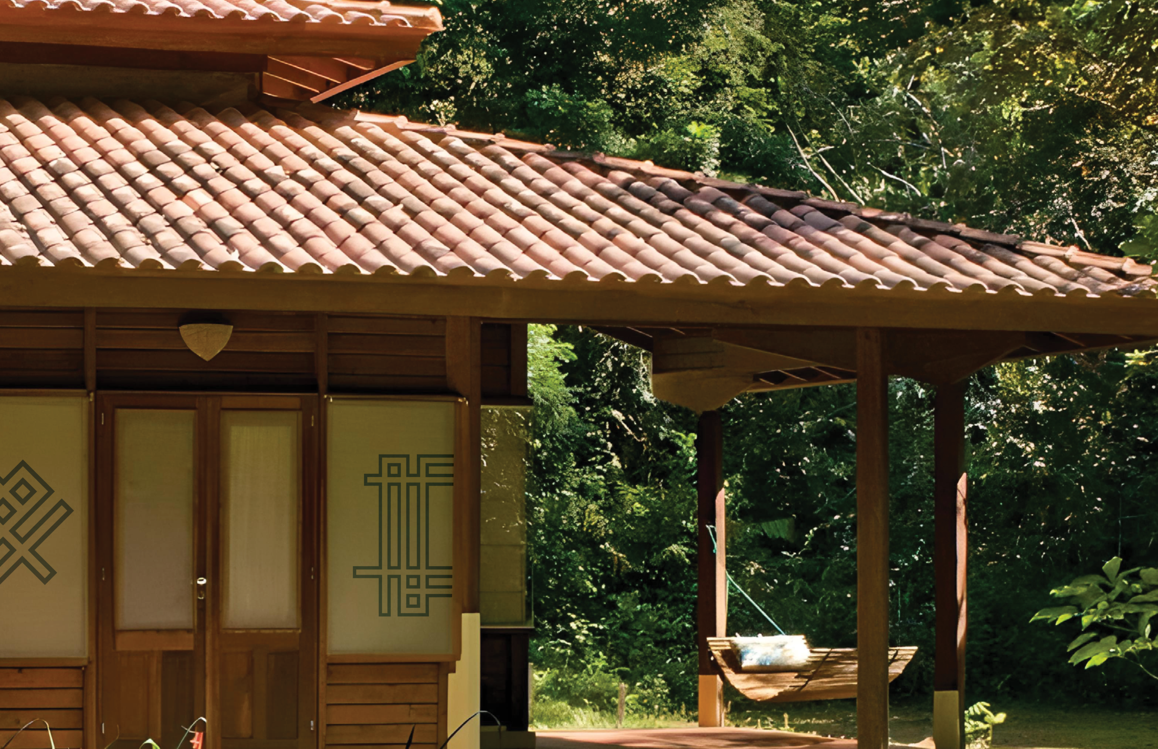
Cristalino Lodge is a luxury resort with an eco-conscious mind, while having a harmonious and dense environment. They are located in Brazil in a private reserve that is tended by the lodge itself. They offer various actives for visitors.
In order to maintain the non-destructive nature of the lodge, it was decided that the graphic elements that interacts with the space to be as non-intrusive as possible. While the logo draws inspiration on the layout of the lodge as well as how the lodges are constructed overall.
Instructed by: Annie Huang Jack
The logo is inspired by the lodge’s architecture, which follows principles of sustainable design. Stacked strokes reflect the structural forms, while the color palette draws from the surrounding forest.
The Lockup
Primary Color
Secondary Color
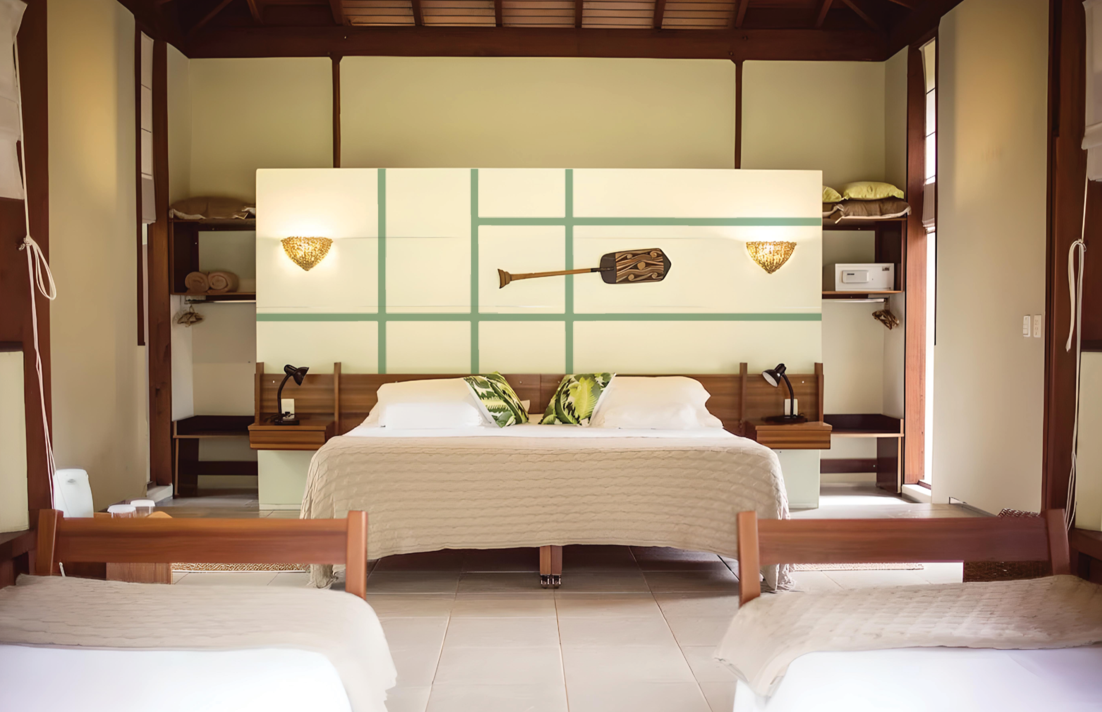
The Lodge
The graphic icon interacts subtly with the environment, preserving the visitor’s sense of immersion while gently reinforcing the brand in a quiet, elegant way.


The Poster.
Let the rain cleanse


Other Variations


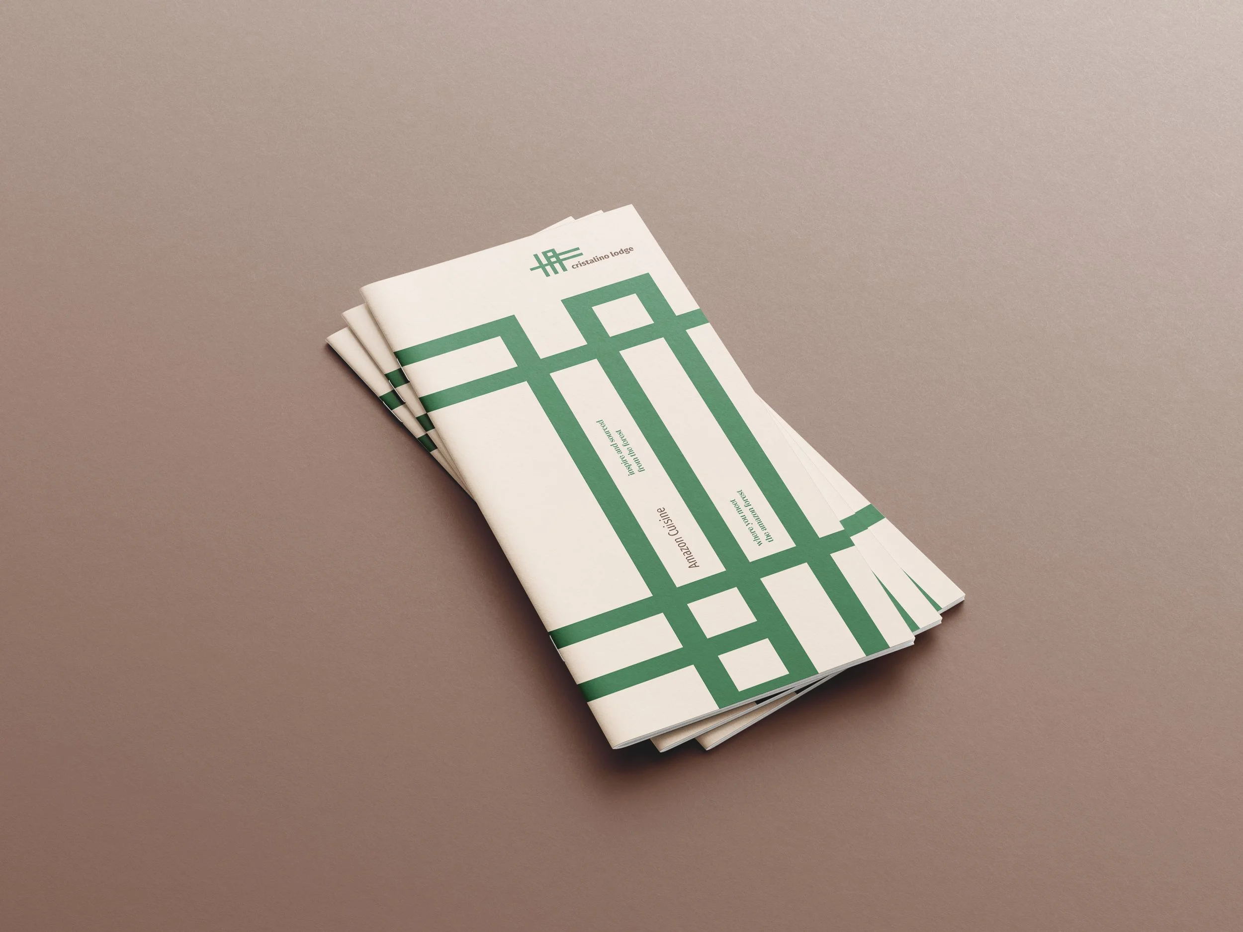
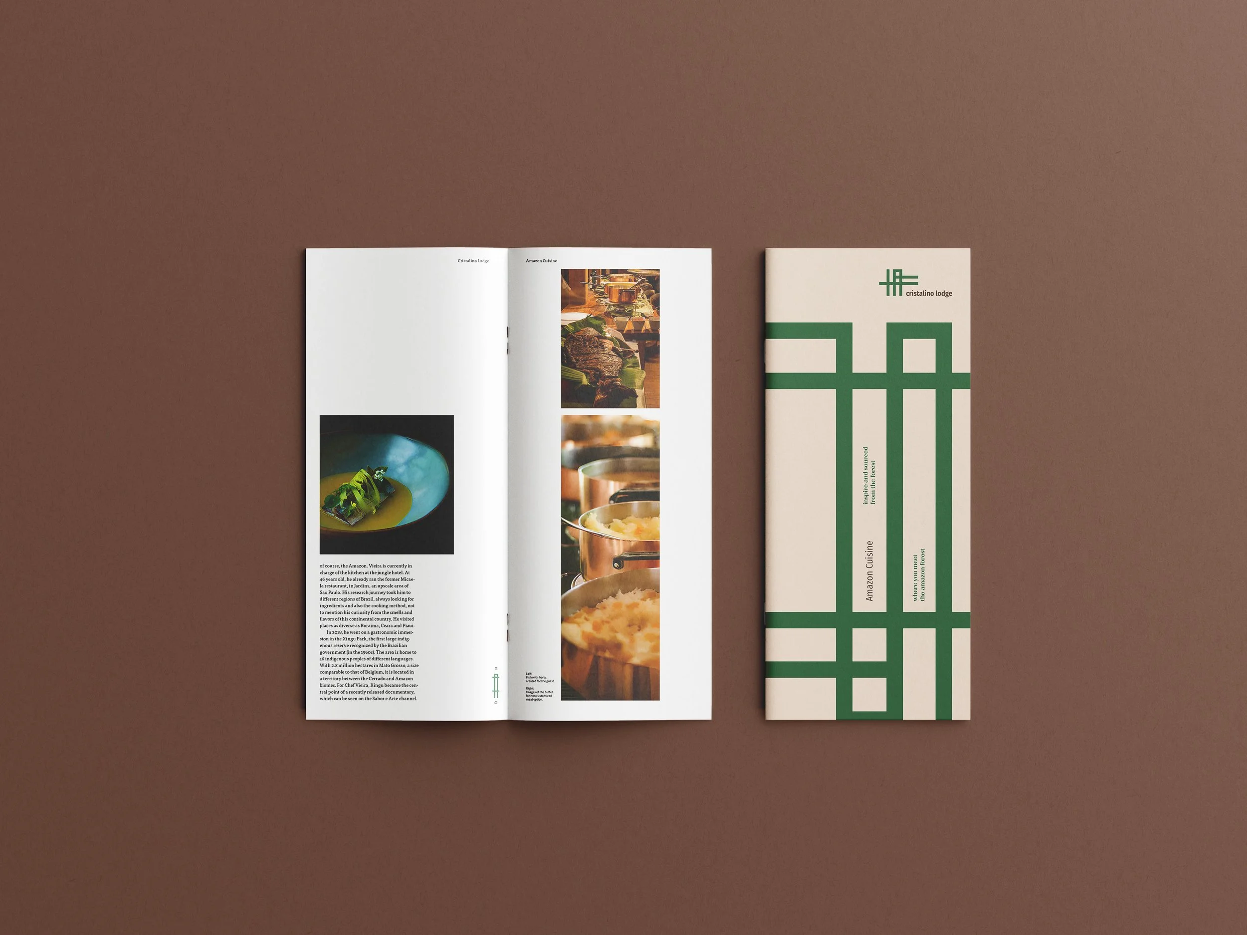
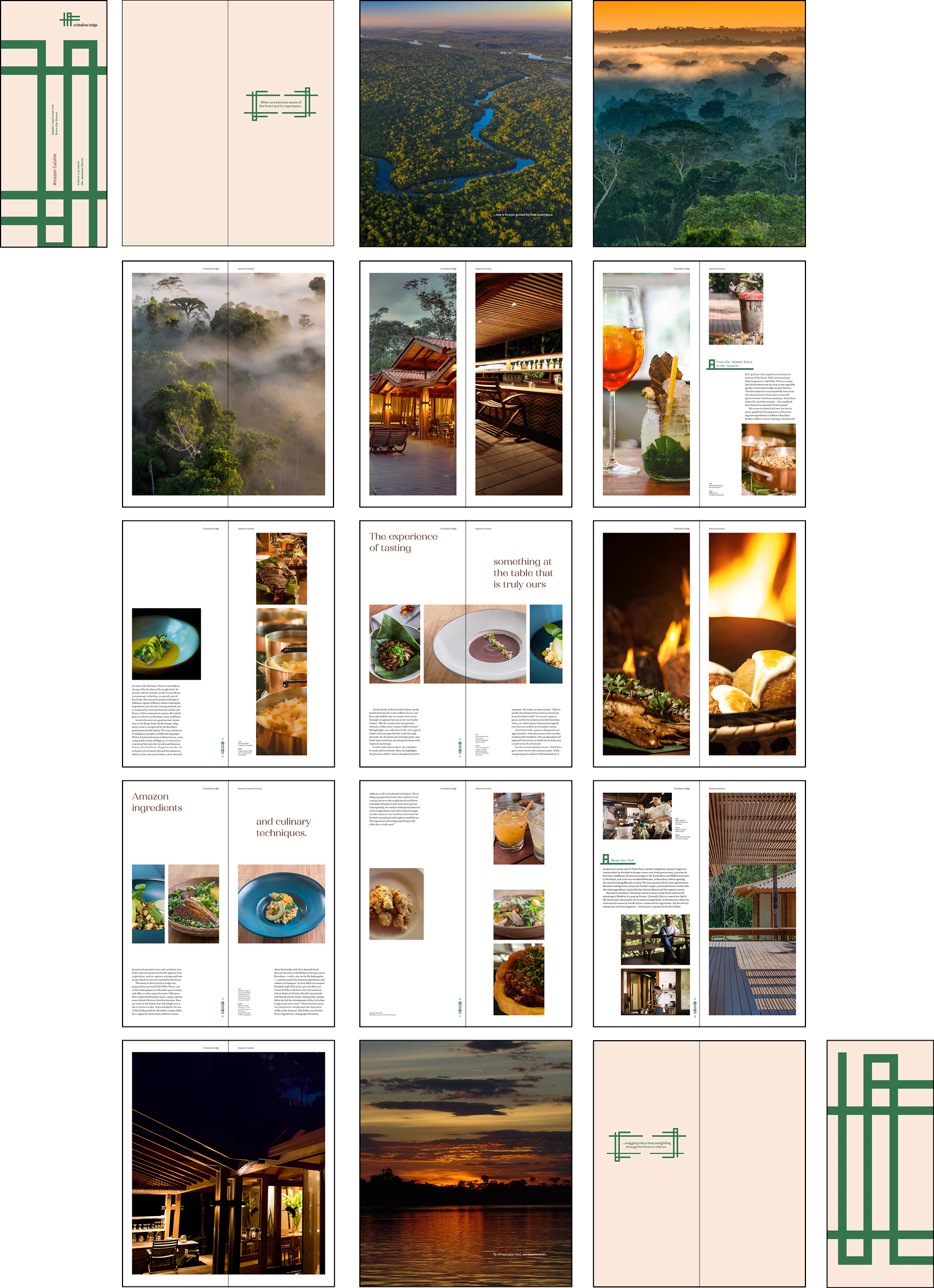
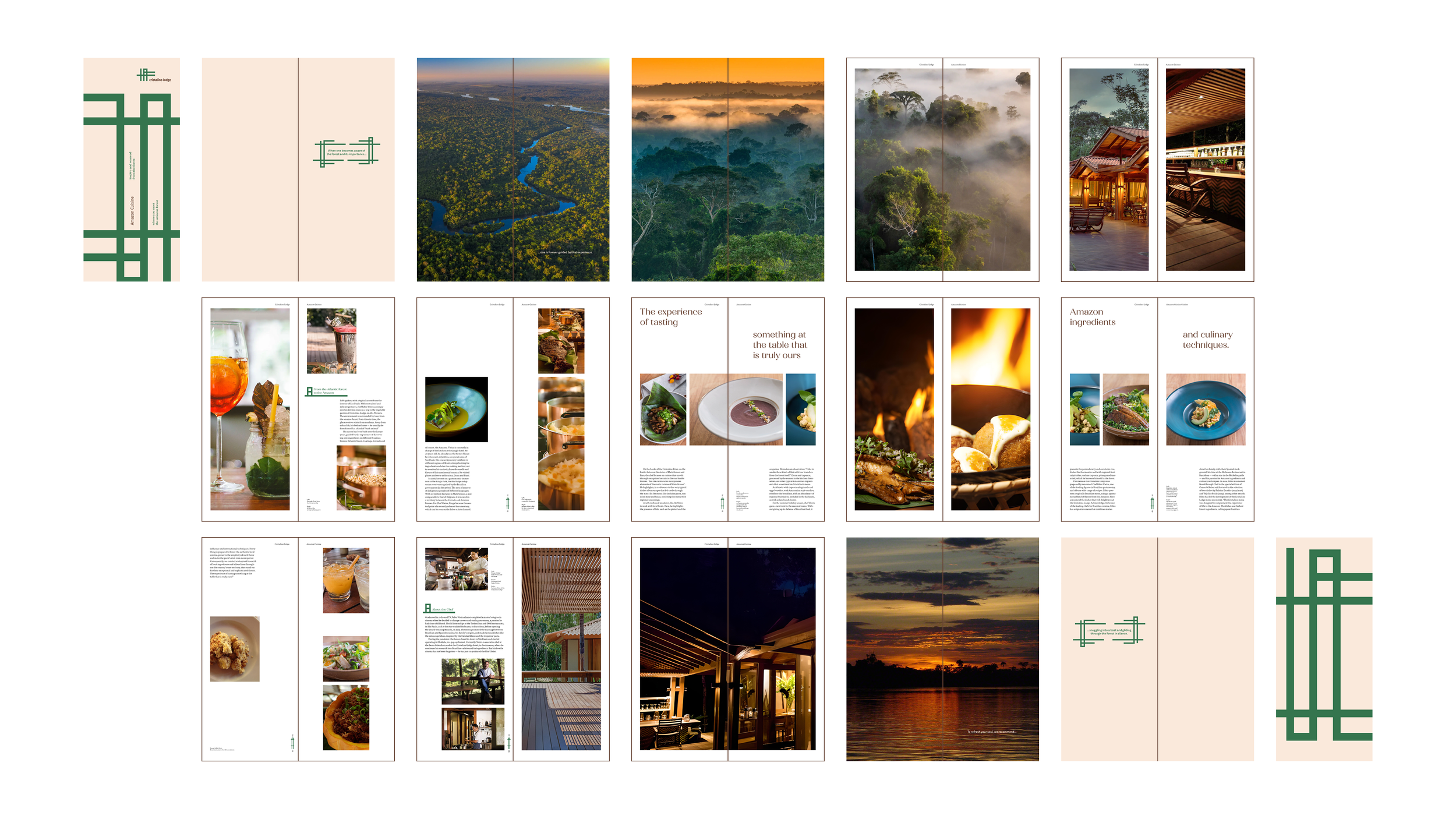
The Look book
This lookbook showcases the lodge’s cuisine, where an award-winning chef meets the rich, diverse ingredients of the Amazon, the very region the lodge calls home.


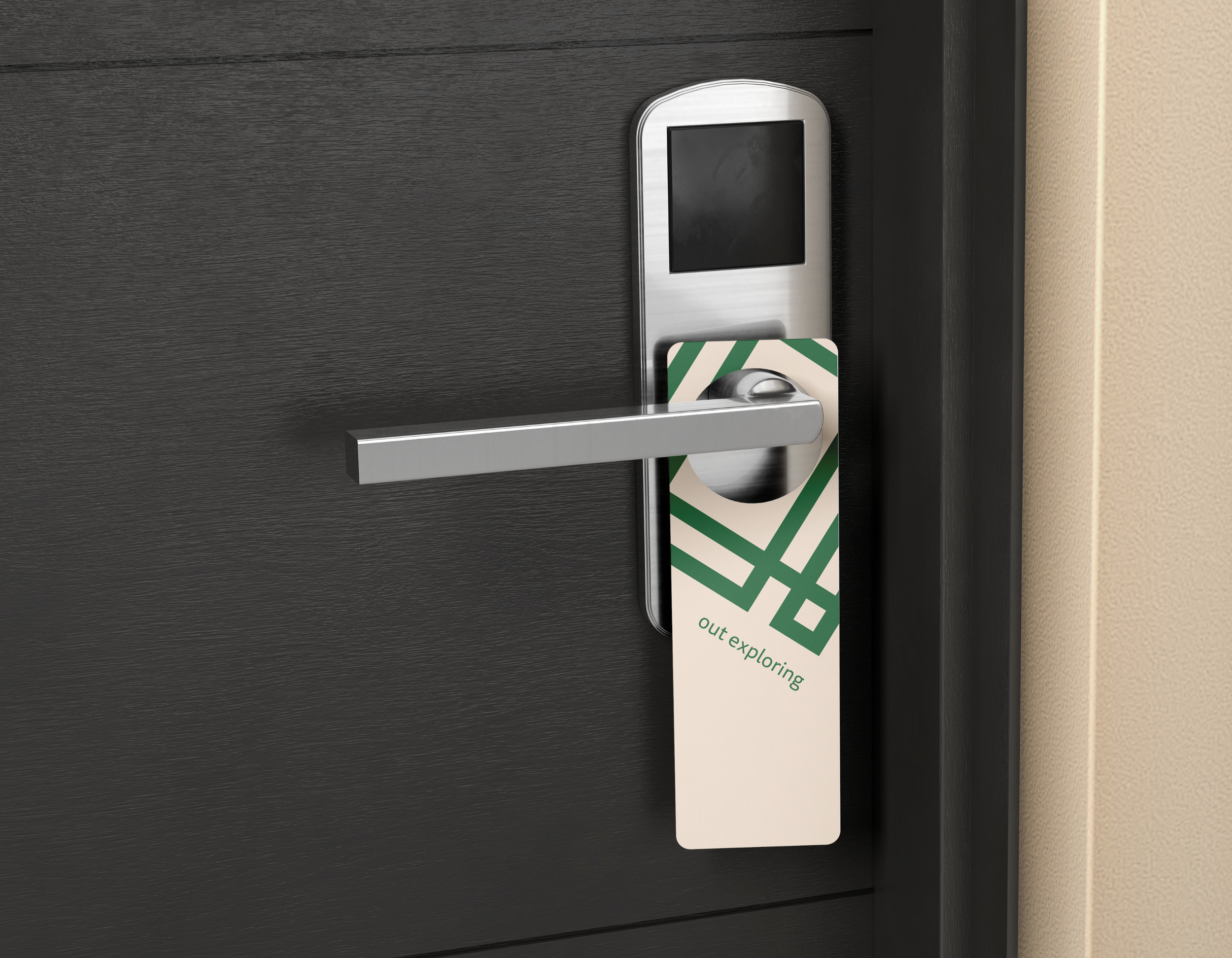
Hotel Amenities
Let the rain cleanse


The Website
Explore the amazon